
branding
Siesta
Siesta is a home decor brand. The brand is about cosiness first and foremost and that's what I've reflected in the design.
about project
Siesta is home decor brand that strongly believes as a part of their core philosophy that home decor is not about filling, cluttering or populating the space, its about liberating, unbridling and letting the space breathe so it can the ambiance and more importantly the atmosphere it is intented to create.
about brand
More details — more comfort, cosiness and the desire to be in a particular space. It is this position of the Brand that is reflected in the design.
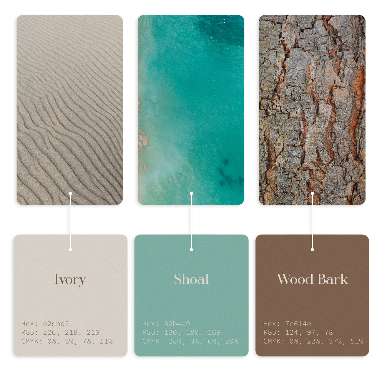
The colours for the design are chosen on the basis of calm and comfortable associations with nature. To add to the cosiness, muted and not motley colours are chosen.
about colors
Creativity is to discover a question that has never been asked. If one brings up an idiosyncratic question, the answer he gives will necessarily be unique as well.
Main Font - Harmony.
The name of the font speaks for itself. This Serif Font is chosen as an accent on detailing, after all cosiness is about details .
The name of the font speaks for itself. This Serif Font is chosen as an accent on detailing, after all cosiness is about details .
For the project I created: visual identity, logotype, print & social media design
about typograpgi
